Energy, data, environment
1480 stories
·
2 followers

Britain Lost 14,000 Third Places. They Were Called Pubs. Is Your Local Next?

1 Share

My brother is coming to visit London. He wants one thing: beer. Apparently a lot of it. If there is one thing I don't know much about, it's beer and pubs. I'm Gen Z. I'm up at 6:30 for a sunrise run. My idea of a Saturday well spent is an 80-mile ride followed by a flat white. My brother, a Gen Y edge case, considers this a character flaw.

So I did what every little sister would do: instead of finally getting my payback for two decades of him beating me at every sport imaginable (…he was just taller), I opened VS Code. One evening later, I have 49,840 pubs in a dataframe, an NLP classifier on pub names, a pub vulnerability model, and an interactive tool that lets you check whether your own local looks structurally at risk.

His requested pub crawl - my original goal - is in there somewhere. But first: what I found isn’t really a story about beer. It’s a story about what happens to a country when the places where people belong become assets on someone else’s balance sheet.

I’ve lived in four countries in the last few years. I am not, by temperament, a pub person. But some of the most at home I’ve ever felt has been in exactly the kind of places this piece is about.

In Brooklyn (not New York), a tiny town north of Sydney on the Hawkesbury River, the kind of place with one pub and one opinion about outsiders, we entered the quiz as "The Wookies" (yes, that's a Star Wars reference) and somehow, against all odds, narrowly beat the local elderly ladies from Mooney Mooney. When we passed our prize back to them, something shifted. They started talking and suddenly we weren't tourists. We felt at home.

Or in Tuscany, just after I’d moved and didn’t speak a word of Italian, I was cycling behind a local club ride and held the wheel for 40km, eventually pulling on the front for them. After the ride, with some very Italian hand gestures, they invited me to a bar in a tiny village on the piazza. Over a vino rosso we exchanged a few broken sentences about the best routes. I felt at home.

Neither moment was planned. Neither required an app, a membership, or a booking. They happened because a place existed - open, informal, cheap enough that the price of entry was just showing up.

Ray Oldenburg called these spaces third places: not home, not work, but the pubs, cafés, and piazzas where community happens without anyone organising it. Robert Putnam, in Bowling Alone, measured what happens when they vanish: trust collapses, civic life withers, democracy frays. No places, no trust. No trust, no society. But neither asked the question that matters most for Britain in 2026: who is doing the dismantling of these third spaces, and why?

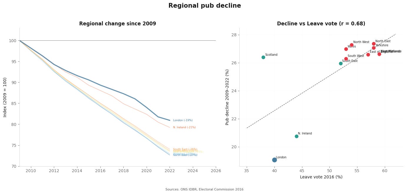
First, let’s put some more numbers to this. I pulled the UK business register snapshots for SIC 56302 (public houses and bars), from 2009 to 2022. Britain went from ~54,000 registered pubs to under 40,000. Over 14,000 gone. A quarter of the total. The trend is relentlessly downward.

(The ONS methodology captures businesses registered for VAT and/or PAYE. Very small pubs below the VAT threshold, the kind of micro-local that matters most, may be undercounted. In other words, the real number is probably worse.)

The timeline is a political economy in miniature: the beer duty escalator (scrapped 2013 after years of above-inflation hikes), the 2017 business rates revaluation, COVID, the 2022 energy crisis. But the point is: the decline predates the shocks. This isn’t one bad year, it’s structural.

Every region is losing. The North East, North West, Yorkshire, and the Midlands fastest - 25-30% of their stock. London least. The correlation between regional pub decline and the 2016 Leave vote is r = 0.67. I won’t claim causation with twelve data points, but the comfortable reading is Putnam's passive erosion of social capital. I’ll soon come to the harder reading of this.

The Brooklyn pub quiz happened because the pub existed. The cycling club aperitivo happened because the village bar existed. What happens in a town where neither does?

So I took all surviving pubs and every pub that has closed since 2016, and asked a simple question: what's structurally different about the ones that died?

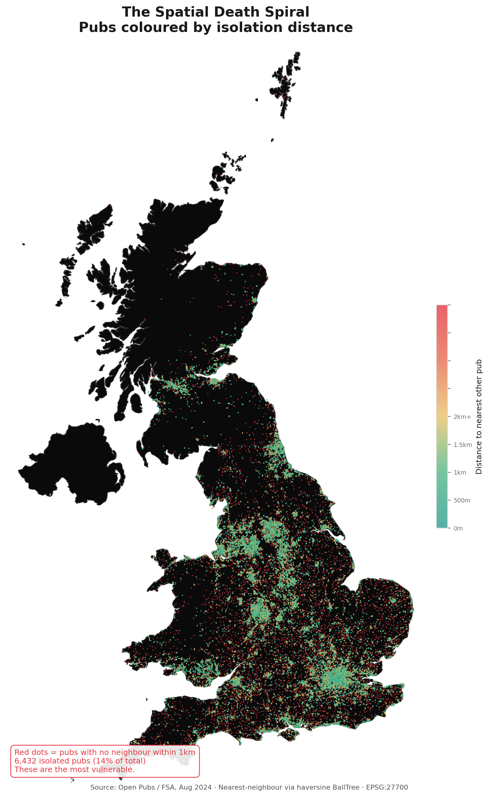
I trained a random forest model (an algorithm that builds thousands of decision trees and asks each one what matters most) on several structural characteristics of every pub in the dataset to predict which pubs closed between 2016 and 2024. Then I decomposed the feature importances to see what mattered most. The overwhelming winner was spatial isolation: how far a pub stood from its nearest neighbour and how many other pubs existed within walking distance. The model was telling me something simple. Pubs don't die because of what's inside them. They die because of what's around them.

How exactly did I measure isolation? I calculated the distance to each pub’s nearest neighbour using a haversine BallTree. Translation: straight-line distance over the Earth’s surface and not walking time. (And yes, I used a BallTree instead of a KDTree. The curvature of the Earth matters when your dataset spans from Cornwall to Caithness. I will not be taking questions.) Then I did the same for every pub that has closed since 2016, using archived snapshots of the same dataset.

The pattern is as follows: median nearest-neighbour distance for a surviving pub: ~280 metres. For a pub that closed: ~640 metres. Simply said: pubs that were isolated died while pubs in clusters survived. The red dots on the map are the next to go. They are disproportionately rural, disproportionately northern, disproportionately in the same communities that have already lost the most.

And it’s not just correlation in a static picture. It’s dynamic. Every pub that closes increases the isolation of the remaining pubs, pushing more of them into the danger zone. This is the spatial death spiral.

As promised, the harder reading of the decline of pubs. Brett Christophers (Rentier Capitalism) and Grace Blakeley (Stolen) can offer an answer. The UK economy increasingly extracts value from assets such as land, housing, infrastructure, rather than producing it. The pub is a perfect case study: it sits on land, it has a freehold, it generates modest cash flow. For a private equity firm, that’s not a community asset, it’s a leveraged buyout opportunity. Acquire, load with debt, extract, underinvest, and when the pub becomes unviable, sell the land to developers at a multiple.

We have already seen that isolated pubs die. But pub isolation isn’t a coincidence, someone creates it. When a pubco owns thirty pubs in a region and decides to cut the five least profitable, the remaining twenty-five don’t just lose neighbours. They lose the clustering effect that was keeping them alive. In other words, the just identified spatial death spiral has an author.

The regions that lost most pubs are the regions where ownership was most consolidated under leveraged pubco models. When Ei Group raised rents to service its debt, it was tenants in Sunderland and Burnley who couldn’t pay, not tenants in my dear Islington.

Britain’s largest pub company is called Stonegate: roughly one in eleven falls under this. You know the brands: Slug & Lettuce, Yates’s, Walkabout, all owned by TDR Capital, a private equity firm that also owns Asda. Its corporate structure runs through the Cayman Islands.

Stonegate carries over £3 billion in debt, mostly from its leveraged acquisition of rival Ei Group in 2019, completed months before the pandemic shut every pub in Britain. In 2024: £455 million in interest payments, a £214 million loss, and a citation from the Department for Business for failing to pay minimum wage to 3,650 workers.

It’s not alone. Greene King (~2,700 pubs) was taken private by Li Ka-shing’s Hong Kong property empire for £4.6 billion. Punch Pubs (~1,300 pubs) was bought by Fortress Investment Group, a US private equity firm formerly owned by SoftBank; now majority-owned by Mubadala (Abu Dhabi). Between them, PE-backed and overseas-owned companies control roughly a quarter to a third of every pub in Britain.

So here’s the political economy of pub closures. It is not: people stopped going. It is: pubs became collateral in leveraged buyouts, debt costs were passed down as higher rents and lower investment, and the pubs that couldn’t sustain the extraction closed, while the ones that could were reshaped into higher-margin branded concepts serving a wealthier clientele.

The Bricklayers Arms didn’t die of natural causes. It was killed by a balance sheet in George Town. And if you think London escaped this, look closer…

London looks like the success story. Smallest decline nationally. If you live in Hackney or Peckham, you might think the pub is thriving: new taproom on every corner, natural wine bar where the laundrette used to be.

London didn't lose its pubs. It swapped them. And this is where the spatial story meets the ownership story. In Burnley, private equity closes a pub and nothing replaces it since the land isn't worth enough. In London, the land is worth plenty, so the site reopens: refitted, rebranded, repriced. The count stays stable. But the name changes, and so does who walks through the door. This is why the random forest flagged spatial isolation as the dominant predictor: it's not geography acting alone, it's the financial logic of extraction expressing itself spatially. PE firms don't close pubs at random. They close the ones that sit on cheap land with thin margins and replace the ones that sit on expensive land with higher-margin concepts. The map of pub death is a map of where extraction was profitable and reinvestment wasn't.

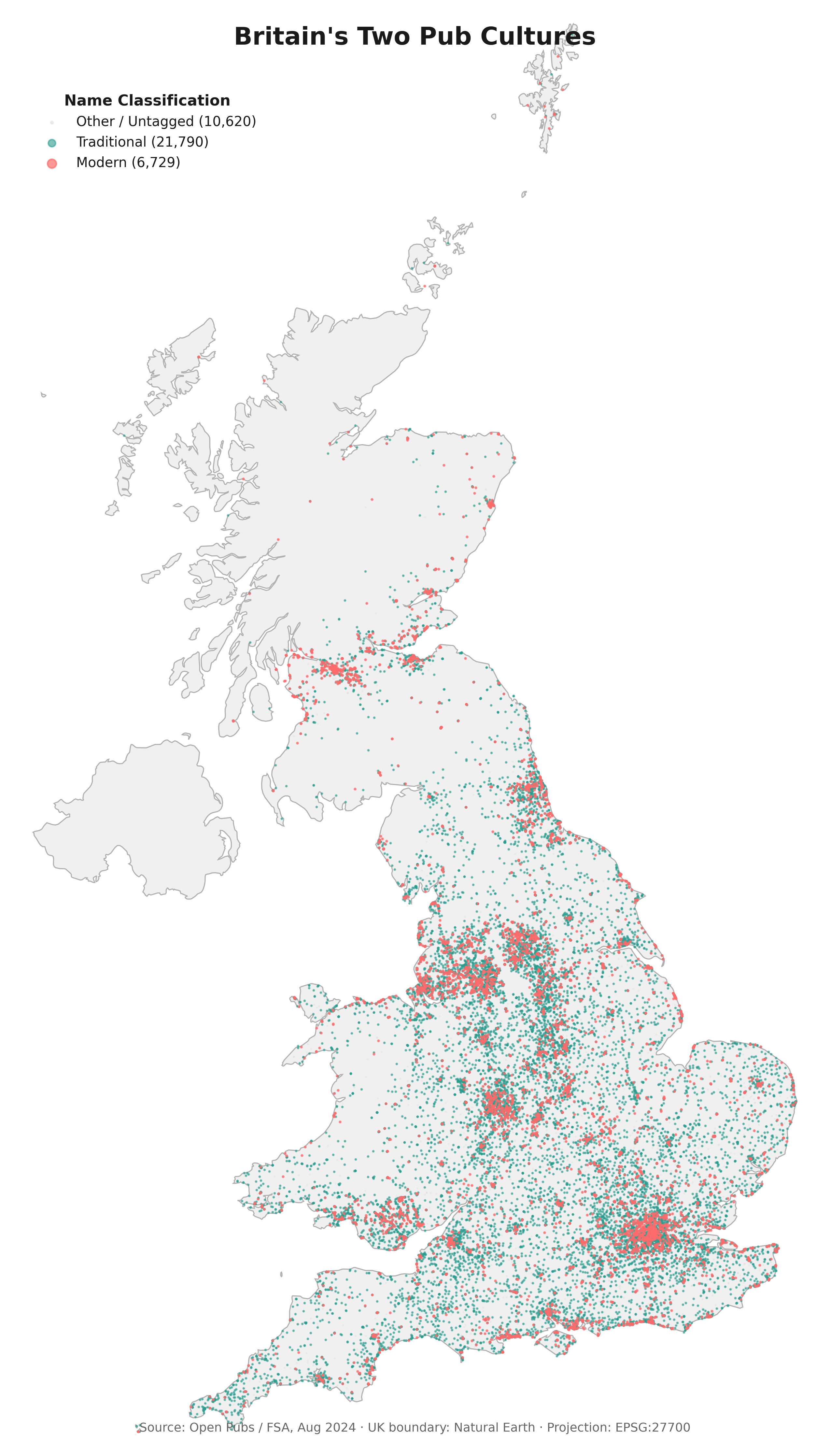
I used the pub names to expose it. I classified every surviving London pub as either traditional: such as Red Lion, Kings Arms, Bricklayers Arms, names encoding centuries of heraldry, trades, and coaching roads or as modern, such as The Yard, The Social, Tap Room, names that strip away history for something brandable. Then I mapped them.

Traditional pubs scatter across all of London: inner, outer, rich, poor. Modern pubs cluster in zones 1-2 and the gentrification corridor from Hackney through Peckham. London's count looks stable because craft taprooms in gentrifying postcodes replace closures in outer boroughs. But a £7.50 hazy IPA in Dalston is not the same third place as a £2.50 pint in a working men's club in Barking.

I didn’t want to rely on my own keyword list, so I ran a sanity check using machine learning. (ML people: TF-IDF on character n-grams of every London pub name, K-means clustering projected via PCA. I know, TF-IDF on character n-grams is not state of the art. But when your unsupervised model rediscovers the same class structure that took historians centuries to document, you don't need BERT/ fancy fine-tuned LLM). Simply said, I fed every pub name into an algorithm that breaks words into small character fragments, think of it as teaching a model to recognise the texture of a name rather than its meaning. Then I asked it to sort all names into groups, with no information about history, geography, or what “traditional” even means.

It found the same divide I did. And when I plotted those algorithmically-discovered groups back on the map, they had geography: old-textured names in the suburbs, new-textured names in the centre. The algorithm sees what the eye sees - naming eras are a spatial signature of class.

Teal: the old Britain: heraldic, royal, rural, trades, naval. Pink: the new Britain: bars, kitchens, tap rooms. The countryside is teal and the cities are turning pink. Both are valid places to get a drink. But only one is a third place in Oldenburg’s sense: a space where the full cross-section of a community meets without requiring a particular income, education, or cultural fluency to walk through the door.

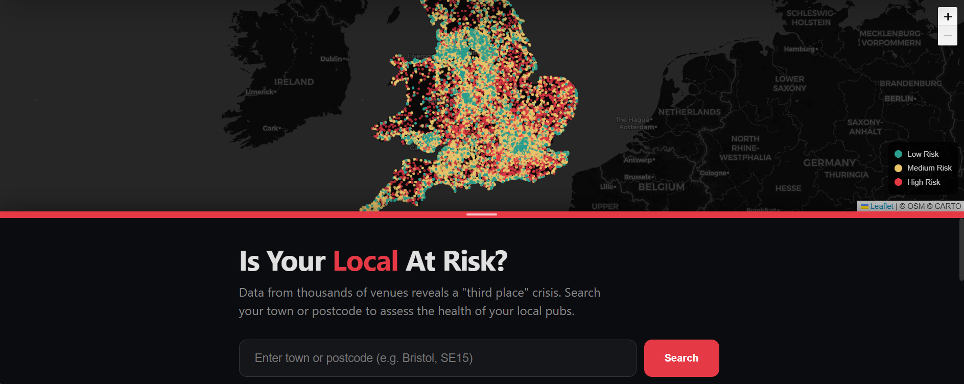
So what do you do with this information? I built a companion tool: Is Your Local At Risk?

The model behind it is deliberately simple and that's the point. For every one of Britain's pubs, I calculate two things: how far away is the nearest other pub (nearest-neighbour distance, via haversine BallTree), and how many pubs exist within a walkable radius (pub density). Those two spatial signals get combined into a continuous risk score, then bucketed into green (clustered, resilient), amber (thinning), and red (isolated, vulnerable).

That's it. No pricing data, no opening hours, no operator quality scores. Just structure and space. Because the finding from the closure analysis is stark: the single strongest predictor of whether a pub closed between 2016 and 2024 is how alone it was. Not how good the beer was or who owned it. But whether it had neighbours.

Enter your postcode and see every pub within walking distance, scored green/amber/red by the vulnerability model. The risk scores, not coincidentally, map onto the worst loneliness scores in the ONS wellbeing data.

The tool won't tell you btw whether your local does a decent Sunday roast (I’m working on that model, it just requires some more field research). But it will tell you whether the spatial conditions around it look like the conditions that preceded every closure in the dataset.

The fatalist reading of this all is that: pubs close because economics, because supermarket alcohol, because young people don’t drink as much (pls don’t blame Gen Z for this one, we inherited the wreckage). These are real factors. But they’re the cover story for a series of reversible policy choices. Britain chose to tax a pint in a pub more heavily than wine in a restaurant. Chose permitted development rights that let landlords flip pubs into flats without planning permission. Chose to cut council budgets by 40%, hollowing out the only institution that could have said no.

So here’s my policy brief. I’ll keep it short.

Map it. Build a national Third Place Index. Every neighbourhood scored by density, diversity, and walkability of its social infrastructure. I built a version with free data and a laptop. The ONS has better resources than I do. Presumably.

Protect it. Use the vulnerability model to fast-track the 500 most isolated pubs for Asset of Community Value status (a legal designation that gives communities 6 months to bid when a pub goes up for sale). Require planning permission for any pub conversion, not just where communities have the lawyers and the social capital to fight. The current system protects pubs in Richmond and lets them die in Rochdale.

Fund it. The government spends serious money treating loneliness downstream: social prescribing, befriending services, community connectors. Good programmes. But it’s like funding ambulances while defunding the road barriers. Redirect 10% toward keeping existing third places open. A pub costs less to save than a community centre costs to build, and it comes pre-loaded with something no government programme can manufacture: centuries of accumulated meaning.

Measure it. Add third place access to the Index of Multiple Deprivation (IMD). What gets measured gets managed. Right now a neighbourhood can score perfectly on the IMD while having zero places for its residents to sit together.

Tax it. If TDR Capital wants to own 4,500 British community assets from the Cayman Islands, it can fund the mechanism for communities to buy them back. A levy on offshore-held pub freeholds, ringfenced for community ownership.

Because the counter-model already exists. Community-owned pubs have grown 63% in five years. The model is simple: a community raises shares to buy the freehold. Ownership stays local. Profits get reinvested. No absentee landlord, no debt servicing, no Cayman Islands. The Ivy House in Nunhead became the first pub in Britain listed as an Asset of Community Value, saved from developers by locals who crowdfunded the purchase. It’s still open. The people who own it are the same people who drink in it.

So, the Asset of Community Value framework exists and the co-op model works. What’s missing is money and a government willing to ask where it should come from.

Oh right. My brother.

After all that, here’s what I’ve actually built him: a pub crawl through London that traces the naming eras. I start at a medieval heraldic pub in the City (there are still a few that have served beer since before the Great Fire). Walk east to a Victorian trades pub in Whitechapel - a Bricklayers or a Carpenters. Cross into Hackney for a modern craft spot to see what’s replaced the old guard. South to a coaching inn in Borough. End at a proper South London local that hasn’t changed its name or its prices since Thatcher.

Five pubs. Five centuries. One brother who doesn't know he's about to get a lecture on the financialisation of community infrastructure with his fifth pint. I’ll let you know if he ever forgives me.

Oh, and next month I'm cycling through Australia for six weeks. I want to see whether a country that built its third places differently has built something more durable than what England is losing. Australia's social infrastructure runs on not-for-profit clubs such as RSLs, surf lifesaving clubs, bowls clubs and leagues clubs, all member-owned, community-governed, and structured so that profits stay local. It's essentially the co-op model that Britain is only now discovering, except Australia built thousands of them. The trade-off is that many are funded by poker machines (“pokies”), which is its own political economy story. But the basic architecture of community ownership, democratic governance, no Cayman Islands balance sheet, is what I've been arguing Britain needs. I want to see how it holds up in person. I’ll promise that I’ll bring the dataframe to the pub quiz.

Team name: still The Wookies.

If this was useful, share it - especially with your MP who loves a pint. Hope they love the data too. Also consider buying me a coffee to keep the project alive:)

Share

Read the whole story
strugk
2 days ago
reply
Cambridge, London, Warsaw, Gdynia
Share this story
Delete

Text Is (Still) King

1 Share

Persuasion

Text Is (Still) King

Why the written word will never die.

(Photo via Getty Images.)

The hot new theory online is that reading is kaput, and therefore civilization is too. The rise of hyper-addictive digital technologies has shattered our attention spans and extinguished our taste for text. Books are disappearing from our culture, and so are our capacities for complex and rational thought. We are careening toward a post-literate society, where myth, intuition, and emotion replace logic, evidence, and science. Nobody needs to bomb us back to the Stone Age; we have decided to walk there ourselves.

I am skeptical of this thesis. As a psychologist, I used to study claims like these for a living, so I know that the mind is primed to believe narratives of decline. We have a much lower standard of evidence for “bad thing go up” than we do for “bad thing go down.”

Unsurprisingly, then, stories about the end of reading tend to leave out some inconvenient data points. For example, book sales were higher in 2025 than they were in 2019, and only a bit below their high point in the pandemic.

Independent bookstores are booming, not busting; at least 422 new indie shops opened in the United States last year alone. Even Barnes & Noble is cool again.

The actual data on reading, meanwhile, isn’t as apocalyptic as the headlines imply. Gallup surveys suggest that some mega-readers (11+ books per year) have become moderate readers (1-5 books per year), but they don’t find any other major trends over the past three decades. Other surveys document similarly moderate declines. For instance, data from the National Endowment for the Arts finds a slight decrease in the percentage of U.S. adults who read any book in 2022 (49%) compared to 2012 (55%). And the American Time Use Survey shows a dip in reading time from 2003 to 2023:

Ultimately, the plausibility of the “death of reading” thesis depends on two judgment calls.

First, do these effects strike you as big or small? Apparently, lots of people see these numbers and perceive an emergency. But we should submit every aspiring crisis to this hypothetical: How would we describe the size of the effect if we were measuring a heartening trend instead of a concerning one?

Imagine that Time Use graph measured cigarette smoking instead of book reading. Would you say that smoking “collapsed” between 2003 and 2023? If we had been spending a billion dollars a year on a big anti-smoking campaign that whole time, would we say it worked? Kind of, I’d say, but most of the time the line doesn’t budge. I wouldn’t be unfurling any “Mission Accomplished” banners, which is why I am not currently unfurling any “Mission Failed” banners, either.

The second judgment call: Do you expect these trends to continue, plateau, or even reverse? The obvious expectation is that technology will get more distracting every year. And the decline in reading seems to be greater among college students, so we should expect the numbers to continue ticking downward as older bookworms are replaced by younger phoneworms. Those are both reasonable predictions, but two facts make me a little more doubtful.

Fact #1: There are signs that the digital invasion of our attention is beginning to stall. We seem to have passed peak social media—time spent on the apps has started to slide. App developers are finding it harder and harder to squeeze more attention out of our eyeballs, and it turns out that having your eyeballs squeezed hurts, so people aren’t sticking around for it. It’s no wonder that, after paying $1,000 for a new phone, people will then pay an additional $50 for a device that makes their phone less functional.

Fact #2: Reading has already survived several major incursions, which suggests it’s more appealing than we thought. Radio, TV, dial-up, Wi-Fi, TikTok—none of it has been enough to snuff out the human desire to point our pupils at words on paper. Apparently, books are what some hyper-online people call “Lindy”: they’ve lasted a long time, so we should expect them to last even longer.

It is remarkable, even miraculous, that people who possess the most addictive devices ever invented will occasionally choose to turn those devices off and pick up a book instead. If I was a mad scientist hellbent on stopping people from reading, I’d probably invent something like the iPhone. And after I released my dastardly creation into the world, I’d end up like the Grinch on Christmas morning, dumbfounded that my plan didn’t work: I gave them all the YouTube Shorts they could ever desire and they’re still... reading!?

Perhaps there are frontiers of digital addiction we have yet to reach. Maybe one day we’ll all have Neuralinks that beam Instagram Reels directly into our primary visual cortexes, and then reading will really be toast.

Maybe. But it has proven very difficult to artificially satisfy even the most basic human pleasures. Who wants a birthday cake made with aspartame? Who would rather have a tanning bed than a sunny day? Who prefers to watch bots play chess? You can view high-res images of the Mona Lisa anytime you want, and yet people will still pay to fly to Paris and shove through crowds just to get a glimpse of the real thing.

I think there is a deep truth here: Human desires are complex and multidimensional, and this makes them both hard to quench and hard to hack. That tinge of discontent that haunts even the happiest people, that bottomless hunger for more even among plenty—those are evolutionary defense mechanisms. If we were easier to please, we wouldn’t have made it this far. We would have gorged ourselves to death as soon as we figured out how to cultivate sugarcane.

That’s why I doubt the core assumption of the “death of reading” hypothesis. The theory heavily implies that people who would once have been avid readers are now glassy-eyed doomscrollers because that is, in fact, what they always wanted to be. They never appreciated the life of the mind. They were just filling time with great works of literature until TikTok came along.

I don’t buy this. Everyone, even people without liberal arts degrees, knows the difference between the cheap pleasures and the deep pleasures. No one pats themselves on the back for spending an hour watching mukbang videos, no one touts their screentime like they’re setting a high score, and no one feels proud that their hand instinctively starts groping for their phone whenever there’s a lull in conversation.

Finishing a great nonfiction book feels like heaving a barbell off your chest. Finishing a great novel feels like leaving an entire nation behind. There are no replacements for these feelings. Videos can titillate, podcasts can inform, but there’s only one way to get that feeling of your brain folds stretching and your soul expanding, and it is to drag your eyes across text.

That’s actually where I agree with the worrywarts of the written word: All serious intellectual work happens on the page, and we shouldn’t pretend otherwise. If you want to contribute to the world of ideas, if you want to entertain and manipulate complex thoughts, you have to read and write.

According to one theory, that’s why writing originated: to pin facts in place. At first, those facts were things like “Hirin owes Mushin four bushels of wheat,” but once you realize that knowledge can be hardened and preserved by encoding it in little squiggles, you unlock a whole new realm of logic and reasoning.

That doesn’t mean every piece of prose is wonderful, just that it can be. And when it reaches those heights, it commands a power that nothing else can possess.

I didn’t always believe this. I was persuaded on this point recently when I met an audio editor named Julia Barton, who was writing a book about the history of radio. I thought that was funny—shouldn’t the history of radio be told as a podcast?

No, she said, because in the long run, books are all that matter. Podcasts, films, and TikToks are good at attracting ears and eyes, but in the realm of ideas, they punch below their weight. Thoughts only stick around when you print them out and bind them in cardboard.

I think Barton’s thesis is right. At the center of every long-lived movement, you will always find a book. Every major religion has its holy text, of course, but there is also no communism without the Communist Manifesto, no environmentalism without Silent Spring, no American Revolution without Common Sense. This remains true even in our supposed post-literate meltdown—just look at Ezra Klein and Derek Thompson’s book Abundance, which inspired the creation of a Congressional caucus. That happened not because of Abundance the Podcast or Abundance the 7-Part YouTube Series, but because of Abundance the book.

I know that what we used to call “social media” is now just television you watch on your phone. I know that people want to spend their leisure time watching strangers apply makeup, assemble salads, and repair dishwashers. I know they want to see this guy dancing in his dirty bathroom and they want to watch Mr. Beast bury himself alive. These are their preferences, and woe betide anyone who tries to show them anything else, especially—God forbid—the written word.

But I also know that humans have a hunger that no video can satisfy. Even in the midst of infinite addictive entertainment, some people still want to read. A lot of people, in fact. 5,000 years after Sumerians started scratching cuneiform into clay and 600 years after Gutenberg started pressing inky blocks onto paper, text is still king. Long may it reign.

Adam Mastroianni writes the Substack Experimental History.

A version of this article was originally published at Experimental History.

Follow Persuasion on X, Instagram, LinkedIn, and YouTube to keep up with our latest articles, podcasts, and events, as well as updates from excellent writers across our network.

And, to receive pieces like this in your inbox and support our work, subscribe below:

Discussion about this post

Ready for more?

Send this story to NewsBlur
Shared stories are on their way...
Read the whole story
strugk
15 days ago
reply
Cambridge, London, Warsaw, Gdynia
Share this story
Delete

The missing seventh question: Why perfect carbon accounting fails without honest valuation | illuminem

1 Share

I. When precision becomes a distraction

Mike Berners-Lee of Small World Consulting recently set out Six Questions to Ask Your Carbon Accountant, a powerful call for methodological rigour in corporate emissions reporting. His questions focus on completeness, truncation error, Scope-3 integrity, aviation impacts and methodological transparency — the technical foundations of credible carbon accounting. They are necessary. But they are not sufficient.

Even perfect accounting cannot correct a deeper failure: we are valuing carbon at levels that make climate destruction economically rational. We now measure emissions with forensic precision while pricing them at levels that systematically instruct markets to continue destabilising the climate. The result is not better climate outcomes — it is the rigorous documentation of failure.

II. Carbon pricing is market infrastructure, not ESG decoration

Carbon pricing is not an Environmental, Social and Governance (ESG) metric. It is financial infrastructure — the switch that determines which projects receive capital, which business models survive, how sovereign and corporate risk is priced, and whether clean technologies clear investment hurdle rates.10, 17 When carbon is mispriced, markets are not merely inefficient — they are structurally miswired to produce the wrong outcomes.

The World Bank’s State and Trends of Carbon Pricing 2023 documents that carbon pricing instruments now cover roughly 23% of global emissions, with revenues exceeding $95 billion annually.17 Yet these instruments operate within a framework where prices remain systematically disconnected from the physical and economic realities of climate damage. Newell et al. (2014) demonstrate that carbon market design, stability, and reform are critical determinants of whether pricing mechanisms can achieve their intended environmental objectives — but design alone cannot compensate for fundamental undervaluation.10

If carbon is priced below its true social cost, financial institutions are systematically misclassifying climate risk — mispricing capital, understating transition exposure, and compounding systemic financial instability.

III. The valuation gap

The divergence between market prices and scientifically grounded damage estimates is substantial and systematic:

Voluntary carbon markets, which traded approximately 200 million tonnes of CO₂ equivalents in 2022, clear at prices ranging from $5 to $50 per tonne, with median prices well below $20.4, 15 These markets, despite their growth, operate primarily as mechanisms for optional corporate engagement rather than as price signals reflecting actual climate costs.

Regulated emissions trading systems — including the European Union Emissions Trading System (EU ETS) and the UK ETS — have seen prices rise to approximately €80–110 per tonne in recent years.17 While this represents significant progress from earlier price levels, these figures remain politically constrained and well below high-integrity academic estimates. Newell et al. (2014) note that political economy constraints systematically limit the stringency of cap-and-set mechanisms.10

Conventional social cost of carbon (SCC) estimates using standard integrated assessment models with 3% discount rates have historically ranged from $50–100 per tonne.11 Nordhaus’s widely cited work employs a damages function calibrated to conventional economic assumptions about future growth, technological change, and the monetary value of climate impacts.

Ethical SCC estimates that weight intergenerational equity more heavily — as advocated by Stern (2007) using near-zero pure time preference — yield valuations of $150–400+ per tonne. Stern’s framework rests on the ethical position that future generations’ welfare should not be discounted merely because they exist in the future, a stance supported by Arrow et al. (2013) in their analysis of determining benefits and costs for future generations.1, 14

SCC estimates incorporating tipping point risks range from $300–700+ per tonne. Cai et al. (2016) demonstrate that environmental tipping points — such as Arctic methane release, Amazon dieback, or Atlantic Meridional Overturning Circulation collapse — significantly affect cost-benefit assessments of climate policies.2 Dietz et al. (2021) extend this analysis by showing that economic impacts of tipping points in the climate system are non-linear and potentially catastrophic, fundamentally altering optimal policy responses.3

The most comprehensive recent meta-analysis by Rennert et al. (2022), published in Nature, synthesises updated climate science, economic modelling, and damage function research to argue that comprehensive evidence implies a substantially higher social cost of CO₂ — potentially exceeding $185 per tonne under central assumptions and rising to several hundred dollars when catastrophic risks are properly incorporated.13

High-integrity academic estimates, therefore, exceed prevailing market prices by factors of 5–20×. At current prices, destabilising the climate remains cheaper than protecting it.

IV. Why carbon’s “true cost” cannot be purely calculated

The social cost of carbon is not a single number — it depends on ethical choices that cannot be resolved through calculation alone. Arrow et al. (2013) emphasise that discount rate selection involves irreducible normative judgments about intergenerational equity.1 A 3% discount rate, commonly employed in policy analysis, implies that damages occurring 50 years hence are worth less than one-quarter of equivalent damages today — a position that may be economically conventional but is ethically contentious.14

Weitzman (2009) argues that conventional damage functions systematically underestimate the probability and impact of catastrophic climate outcomes. His analysis of “dismal theorem” scenarios — where the expected value of climate damages may be infinite due to fat-tailed distributions of catastrophic risk — challenges the entire framework of cost-benefit analysis as applied to existential threats. Pindyck (2013) reinforces this critique, noting that integrated assessment models rest on damage functions with limited empirical grounding, particularly at high temperatures where non-linear and threshold effects dominate.12, 16

The treatment of non-market values — species extinction, cultural heritage loss, forced displacement — further illustrates that carbon valuation embeds ethical positions disguised as mathematics. These are not technical parameters. They are moral choices about whose welfare counts and how much.

V. Why measurement alone cannot fix this

Consider two identical companies with identical emissions inventories of 10,000 tonnes CO₂e annually. Both have undertaken comprehensive Scope 1, 2, and 3 accounting. Both have verified their data to ISO 14064 standards. The measurement is identical. Yet the strategic implications diverge radically depending on carbon valuation:

• At $10/tonne: Annual cost = $100,000. Strategic signal: “immaterial cost; maintain business as usual.”

• At $300/tonne: Annual cost = $3,000,000. Strategic signal: “material existential risk; transform business model immediately.”

Valuation — not measurement — determines outcomes. This is why Rennert et al. (2022) and the International Energy Agency argue that carbon pricing levels, not merely accounting precision, are the critical determinant of whether investment flows align with 1.5°C pathways.7, 13

VI. Temperature is a stock problem, not a policy variable

Global mean temperature is governed primarily by atmospheric CO₂ concentration (measured in parts per million) — a stock variable, not a flow variable. Once emitted, CO₂ persists for centuries (IPCC, 2021). Each year of carbon undervaluation irreversibly ratchets the atmospheric stock upward. Nationally Determined Contributions (NDC) failure does not merely delay progress; it locks in future warming that no later policy correction can undo.

The IPCC’s Sixth Assessment Report (2021) confirms that warming is approximately linearly proportional to cumulative emissions, meaning that every tonne of CO₂ added to the atmosphere commits the planet to additional warming.6 Carbon mispricing, therefore, creates an irreversible physical ratchet with compounding fiscal and credit consequences.

VII. The sovereign debt time bomb

Stage 1: Undervaluation delays transition and locks in stranded assets

Pricing carbon at $10–50 instead of $200–400 creates three distinct market failures:

First, it delays the retirement of existing fossil infrastructure. While new renewable electricity generation is now cheaper than new fossil plants in most markets, low carbon prices make continued operation of existing fossil assets — with sunk capital costs already paid — appear economically rational even when incompatible with climate targets.7 Coal plants, gas infrastructure, and petrochemical facilities continue operating past their climate-compatible retirement dates because carbon externalities remain unpriced.

Second, it enables marginal new fossil investments that should not proceed. In hard-to-abate sectors — heavy industry, long-haul aviation, maritime shipping, and certain industrial processes — clean alternatives remain more expensive than incumbent fossil technologies. Low carbon prices systematically bias investment decisions toward fossil lock-in in precisely those sectors where technological transformation is most urgent but economically challenging.

Third, it misdirects capital flows. The IEA’s Net Zero Roadmap demonstrates that achieving 1.5°C pathways requires carbon prices to reach $130–250 by 2030 in advanced economies — levels far exceeding current market realities.7 When carbon is underpriced, private capital systematically flows to high-carbon activities that maximise short-term returns while accumulating long-term climate liabilities. Paris Agreement targets become structurally unachievable when price signals are systematically inverted.

Stage 2: NDC failure becomes physical damage

If current policies continue rather than meeting NDC commitments, projected warming rises from 2.0–2.4°C to 2.7–3.0°C by 2100.6 Howard and Sterner’s (2017) meta-analysis of climate damage estimates demonstrates that each additional 0.5°C of warming pushes economies into non-linear damage regimes where losses accelerate.5 Extreme weather events increase in frequency and intensity by factors of 4–6× rather than 2–3×, forced climate migration potentially escalates from 50–100 million to 200–300 million people, and annual adaptation costs double from $140–300 billion to $280–500 billion globally.

Stage 3: Climate damage erodes fiscal capacity

Climate impacts manifest as disaster reconstruction costs, agricultural collapse, tourism decline, health system strain, and forced migration — each of which suppresses GDP, erodes tax revenues, and strains government budgets.5 The asymmetry is brutal: the most climate-vulnerable states face the highest damage and the least fiscal buffer.

Stage 4: Credit downgrades create debt spirals

Climate damage reduces economic growth, which increases fiscal stress, which triggers sovereign credit downgrades. Each ratings notch downgrade typically adds 50–100 basis points to borrowing costs, which increases debt service burdens, which reduces adaptation capacity, which intensifies climate damage, which prompts further downgrades.18 This self-reinforcing debt-climate doom loop is already visible in multiple small island developing states and climate-vulnerable economies. The International Monetary Fund warns that 50–60 emerging markets face heightened climate-related credit risk by 2030.

VIII. Transition risk: Cheap carbon today guarantees violent adjustment tomorrow

Delayed carbon pricing does not avoid economic disruption — it amplifies it.3,7 Honest pricing implemented now permits gradual 40-year capital reallocation as assets naturally depreciate. Delayed pricing necessitates compressed 15-year crash programmes characterised by stranded assets, credit events, and sovereign stress.

The mechanism is straightforward: cheap carbon today encourages continued investment in long-lived fossil infrastructure. When climate damages escalate, or policy finally tightens, that infrastructure becomes economically worthless overnight — stranding trillions in capital and triggering cascading financial instability. Lenton et al. (2019) emphasise that crossing climate tipping points imposes discontinuous regime shifts that cannot be smoothly navigated through incremental policy adjustments.8

IX. The missing seventh question

Berners-Lee’s six questions discipline measurement. The decisive question is:

What value are you placing on carbon — and what ethical framework does it embed?

If the answer is “$10-$20/tonne because that’s what the market charges,” your accounting is methodologically sound — and systemically lethal. Forest Research (2023) confirms that prevailing market prices reflect political economy constraints and voluntary market dynamics rather than defensible estimates of climate damage.4 Pindyck (2013) and Weitzman (2009) demonstrate that conventional economic models systematically underestimate catastrophic risk, embedding ethical assumptions that privilege present consumption over future survival.12, 16

X. Counter-arguments — answered

“High carbon prices kill growth.” Growth models that predict negative impacts from carbon pricing typically assume static technology and ignore cost curves. Yet renewable energy LCOE (levelised cost of energy) has fallen below fossil alternatives in most markets without carbon pricing, and high carbon prices accelerate this technological disruption.7 Moreover, carbon pricing can be growth-neutral or growth-positive when revenues are recycled into productive investment, R&D support, or tax relief that reduces distortionary taxation elsewhere.17 The real growth killer is unpriced climate damage.

“Developing countries can’t afford high carbon prices.” Developing economies suffer most from carbon undervaluation. Climate damage costs substantially exceed carbon pricing costs in climate-vulnerable regions.5 The alternative to high carbon prices is not fiscal stability — it is sovereign debt spirals triggered by escalating climate impacts that destroy tax bases, tourism revenues, agricultural productivity, and creditworthiness. High carbon prices, when coupled with border adjustments and climate finance transfers, protect developing economies from imported climate risk while preserving fiscal sovereignty.

“Use marginal abatement cost (MAC), not social cost of carbon.” This conflates two distinct concepts. MAC measures the cost of reducing emissions — how expensive it is to cut a tonne. SCC measures the cost of not reducing emissions — how much damage that tonne causes. Confusing them is a category error that systematically undervalues climate action by ignoring the avoided damages.9 Rational policy requires both: MAC informs how to abate efficiently; SCC informs how much abatement is justified.

XI. What must change: Specific levers

The path forward requires institutional reforms that make carbon valuation transparent, auditable, and defensible:

ISSB/TCFD Phase 2 disclosure requirements: Mandate disclosure of internal carbon price assumptions alongside high-integrity benchmarks.3,13 Require narrative explanation when internal prices fall below scientifically grounded ranges.

EU Taxonomy and sustainable finance frameworks: Require ethical-framework justification for carbon prices below €100/tonne in investment and lending decisions. Make carbon price assumptions a mandatory disclosure element for “sustainable” classification.

Central bank stress testing: Incorporate carbon-price shock scenarios (e.g., sudden implementation of $200/tonne pricing) into financial stability assessments to expose transition risk concentrations and identify institutions with concentrated exposure to stranded asset risk.

Credit rating agency methodology disclosure: Require agencies to disclose carbon price assumptions embedded in sovereign and corporate ratings, particularly for climate-vulnerable issuers. Ratings should explicitly incorporate transition risk from policy tightening.

Asset manager stewardship codes: Establish voting expectations against boards employing carbon prices below €100/tonne without robust methodological and ethical justification. Link fiduciary duty to climate risk assessment.

These reforms would not dictate a single “correct” carbon price — ethical pluralism permits legitimate disagreement about discount rates and risk tolerance — but they would force transparency about the values embedded in current practice. Arrow et al. (2013) and the National Academies (2017) emphasise that making ethical assumptions explicit is a prerequisite for democratic accountability in climate policy.1,9

XII. Conclusion

Carbon accounting is not an ESG reporting exercise. It is the financial system infrastructure. When carbon is undervalued, Nationally Determined Contributions fail, temperature targets overshoot, sovereign balance sheets destabilise, and debt crises propagate.3, 18 We are not merely measuring our way to climate collapse. We are accounting our way into the next global sovereign debt crisis.

And the hinge on which it turns is the missing seventh question: not how precisely have you measured your emissions, but what value have you placed on carbon, and can you defend it?

Without honest carbon valuation, forensic emissions accounting becomes an elaborate ritual of organised irresponsibility — documenting, with ever-increasing precision, our collective failure to price the most consequential market externality in human history.

illuminem Voices is a democratic space presenting the thoughts and opinions of leading Sustainability & Energy writers, their opinions do not necessarily represent those of illuminem.

See how the companies in your sector perform on sustainability. On illuminem’s Data Hub™, access emissions data, ESG performance, and climate commitments for thousands of industrial players across the globe.

References

1. Arrow, K. J., Cropper, M. L., Gollier, C., Groom, B., Heal, G. M., Newell, R. G., … Weitzman, M. L. (2013). Determining benefits and costs for future generations. Science, 341(6144), 349–350.

2. Cai, Y., Judd, K. L., Lenton, T. M., Lontzek, T. S., & Narita, D. (2016). Environmental tipping points significantly affect the cost–benefit assessment of climate policies. Proceedings of the National Academy of Sciences, 113(15), 4106–4111.

3. Dietz, S., Rising, J., Stoerk, T., & Wagner, G. (2021). Economic impacts of tipping points in the climate system. Proceedings of the National Academy of Sciences, 118(34), e2103081118.

4. Forest Research. (2023). Review of approaches to carbon valuation, discounting and risk management. UK Government.

5. Howard, P. H., & Sterner, T. (2017). Few and not so far between: A meta-analysis of climate damage estimates. Environmental and Resource Economics, 68, 197–225.

6. Intergovernmental Panel on Climate Change (IPCC). (2021). AR6 Working Group I: The Physical Science Basis. Cambridge University Press.

7. International Energy Agency (IEA). (2023). Net Zero Roadmap: A Global Pathway to Keep the 1.5 °C Goal in Reach.

8. Lenton, T. M., et al. (2019). Climate tipping points—too risky to bet against. Nature, 575, 592–595.

9. National Academies of Sciences, Engineering, and Medicine. (2017). Valuing climate damages: Updating estimation of the social cost of carbon dioxide. National Academies Press.

10. Newell, R. G., Pizer, W. A., & Raimi, D. (2014). Carbon market design, stability, and reform. Energy Policy, 75, 22–31.

11. Nordhaus, W. (2017). Revisiting the social cost of carbon. Proceedings of the National Academy of Sciences, 114(7), 1518–1523.

12. Pindyck, R. S. (2013). Climate change policy: What do the models tell us? Journal of Economic Literature, 51(3), 860–872.

13. Rennert, K., et al. (2022). Comprehensive evidence implies a higher social cost of CO₂. Nature, 610, 687–692.

14. Stern, N. (2007). The economics of climate change: The Stern Review. Cambridge University Press.

15. Trove Research. (2023). State of the voluntary carbon market.

16. Weitzman, M. L. (2009). On modeling and interpreting the economics of catastrophic climate change. Review of Economics and Statistics, 91(1), 1–19.

17. World Bank. (2023). State and Trends of Carbon Pricing 2023.

18. World Bank. (2024). Carbon Pricing Dashboard.

Read the whole story
strugk
29 days ago
reply
Cambridge, London, Warsaw, Gdynia
Share this story
Delete

How the UK’s dependency on cars slows down the economy

1 Share

The UK government makes a lot of money from cars. It taxes car ownership, it taxes the fuel, and it is about to charge drivers of electric vehicles by the distance they travel.

But Britons’ reliance on their 34 million cars also comes at great expense to the economy. Heavy traffic and congestion costs £7.5 billion a year in wasted time. An estimated £17 billion is needed to fix the worn out road network.

In the last 30 years, as the UK population has grown by 19%, the number of cars has exploded by 56%. Outside of London, 81% of British households own at least one car.

Fitting all of these vehicles into a fairly small country means that driving has clear priority over other forms of transport. In Germany, 90% of people living in large cities have access to a tramway or underground train system. In France, it’s 80%.

In the UK, the figure is less than 20%, a similar level to the US.

But the US has vast amounts of space, where brand new roads are regularly built to ease congestion. And so the UK has to deal with a population density comparable to the Netherlands (at least for England) and the urban transport choices of Texas.

This lack of decent public transport is expensive to sustain for all sorts of reasons – like the councils forking out £2.3 billion a year transporting 470,000 children to school, mostly in taxis. Or the cost of subsidising 800,000 motability vehicles, which accounted for one in every five new cars sold in 2024.

While the government should absolutely support the travel needs of people with disabilities and help children get to school, in a strange case of state-provided individualism, the UK has become a country where only cars can deliver these vital public services.

Designated drivers

Yet urban design is ultimately a choice. While the UK has a system which allows for 560 cars per 1,000 people, other places have taken a different route.

In Singapore, there are 146 cars per 1,000 people. This came about after the government implemented a quota system to release a limited number of (expensive) car-ownership licenses to limit congestion and finance public transport.

A ten-year “certificate of entitlement” to own a car in Singapore now costs more than US$100,000 (£76,000) on top of an additional congestion tax.

Red locomotive on rails.

Public transport in Singapore. Tupungato/Shutterstock

The result? Singapore’s public transport is cheap, fast, reliable and efficient.

People without cars are fine, because the number of overall cars is so small that buses and taxis don’t get stuck in traffic. People with cars subsidise the buses and trains, while enjoying smooth traffic.

The Netherlands used a different strategy. In the 1970s, Dutch streets were dominated by cars and had become dangerous for pedestrians and cyclists. Protests led to a reorganisation of cities to become far less car friendly.

My research with a fellow economist demonstrated that if you decrease the space given to cars, they go slower, public transit goes faster, and walking and cycling become safer.

Then, as more people turn to public transport, the higher uptake makes it a faster and more reliable form of transit. It gets to a point where people who would never have taken public transport end up using it and getting to their destination much more quickly than when the car was dominant.

So for the UK to be more like Singapore, the government needs to make motorists pay much more for their car use. To be more like the Netherlands, it must take away their space.

The UK, and especially England, which invented the railway and used to be full of electric tramways, has the population density to make a dramatic switch away from cars actually work. In fact, it’s hard to think of a country better suited to public transport, or where it is more needed. It just hasn’t been built.

Or at least, it has not been built outside of London, the only place in the UK where most households don’t own a car.

So London is rich, well connected and people don’t need cars. Elsewhere, people park on pavements in derelict high streets and drive to supermarkets and places of work.

With stretched public finances, doing nothing about this state of affairs is a risky option. The UK has been described by the Local Government Association as a “country in a jam”, where productivity is held back by car traffic, with no hope for improvement. Lost time on roads is set to increase by 27% in the coming decades.

Moving to a situation where cars are not considered the fastest and most convenient mode of transportation will take ambition and imagination. But the alternative is a very expensive dependency, which clogs up the UK economy.

Read the whole story
strugk
32 days ago
reply
Cambridge, London, Warsaw, Gdynia
Share this story
Delete

Adopting low-cost ‘healthy’ diets could cut food emissions by one-third - Carbon Brief

1 Share

Choosing the “least expensive” healthy food options could cut dietary emissions by one-third, according to a recent study.

In addition to the lower emissions, diets composed of low-cost, healthy foods would cost roughly one-third as much as a diet of the most-consumed foods in every country.

The study, published in Nature Food, compares prices and emissions associated with 440 local food products in 171 countries.

The researchers identify some food groups that are low in both cost and emissions, including legumes, nuts and seeds, as well as oils and fats.

Some of the most widely consumed foods – such as wheat, maize, white beans, apples, onions, carrots and small fish – also fall into this category, the study says.

One of the lead authors tells Carbon Brief that while food marketing has promoted the idea that eating environmentally friendly diets is “very fancy and expensive”, the study shows that such diets are achievable through cheap, everyday foods.

Meanwhile, a separate Nature Food study found that reforming the policies that reduce taxes on meat products in the EU could decrease food-related emissions by up to 5.7%.

Costs and emissions

The study defines a healthy diet using the “healthy diet basket” (HDB), which is a standard based on nutritional guidelines that includes a range of food groups with the needed nutrients to provide long-term health.

Using both data on locally available products and food-specific emissions databases, the authors estimate the costs and greenhouse gas emissions of 440 food products needed for healthy diets in 171 countries.

They examine three different healthy diets: one using the most-consumed food products, one using the least expensive food products and one using the lowest-emitting food products.

Each of these diets is constructed for each country, based on costs, emissions, availability and consumption patterns.

The researchers find that a healthy diet comprising the most-consumed foods within each country – such as beef, chicken, pork, milk, rice and tomatoes – emits an average of 2.44 kilograms of CO2-equivalent (kgCO2e) and costs $9.96 (£7.24) in 2021 prices, per person and per day.

However, they find that a healthy diet with the least-expensive locally available foods in each country – such as bananas, carrots, small fish, eggs, lentils, chicken and cassava – emits 1.65kgCO2e and costs $3.68 (£2.68). That is approximately one-third of the emissions and one-third of the cost of the most-consumed products diet.

In comparison, a healthy diet with the lowest-emissions products – such as oats, tuna, sardines and apples – would emit just 0.67kgCO2e, but would cost nearly double the least-expensive diet, at $6.95 (£5.05).

This reveals the tradeoffs of affordability and sustainability – and shows that the least-expensive foods tend to produce lower emissions, according to the study.

Dr Elena Martínez, a food-systems researcher at Tufts University and one of the lead authors of the study, tells Carbon Brief this is generally true because lower-cost food production tends to use fewer fossil fuels and require less land-use change, which also cuts emissions.

Ignacio Drake is coordinator of the fiscal and economic policies at Colansa, an organisation promoting healthy eating and sustainable food systems in Latin America and the Caribbean. 

Drake, who was not involved in the study, tells Carbon Brief that the research is a “step further” than previous work on healthy diets. He adds that the study “integrates and consolidates” previous analyses done by other groups, such as the World Bank and the UN Food and Agriculture Organization.

Food group differences 

The research looks at six food groups: animal-sourced foods, oils and fats, fruits, legumes (as well as nuts and seeds), vegetables and starchy staples.

Animal-sourced foods – such as meat and dairy – are typically the most-emitting, and most-expensive, food group. 

Within this group, the study finds that beef has the highest costs and emissions, while small fish, such as sardines, have the lowest emissions. Milk and poultry are amongst the least-expensive products for a healthy diet.

Starchy staple products also contribute to high emissions too, adds the study, because they make up such a large portion of most people’s calories. 

Emissions from fruits, vegetables, legumes and oil are lower than those from animal-derived foods.

The following chart shows the energy contributions (top) and related emissions (bottom) from six major food groups in the three diets modelled by the study: lowest-cost (left), lowest-emission (middle) and most-common (right) food items.

The six food groups examined in the study are shown in different colours: animal-sourced foods (red), legumes, nuts and seeds (blue), oils and fats (purple), vegetables (green), fruits (orange) and starchy staples (yellow). The size of each box represents the contribution of that food to the overall dietary energy (top) and greenhouse gas emissions (bottom) of each diet.

Energy (top) and emissions (bottom) contributions from different food groups within the three diets modelled by the study.Energy (top) and emissions (bottom) contributions from different food groups within the three diets modelled by the study. Each column represents a different diet (left to right): lowest-cost, lowest-emission and most common items. The boxes are coloured by food group: animal-sourced foods (red), legumes, nuts and seeds (blue), oils and fats (purple), vegetables (green), fruits (orange) and starchy staples (yellow). Source: Bai et al. (2025).

Prof William Masters, a professor at Tufts University and author on the study, tells Carbon Brief that balancing food groups is important for human health and the environment, but local context is also important. For example, he points out that in low-income countries, some people do not get enough animal-sourced foods.

For Drake, if there are foods with the same nutritional quality, but that are cheaper and produce fewer emissions, it is logical to think that the “cost-benefit ratio [of switching] is clear”.

Other studies and reports have also modelled healthy and sustainable diets and, although they do not exclude animal-sourced foods, they do limit their consumption.

A recent study estimated that a global food system transformation – including a diet known as the “planetary health diet”, based on cutting meat, dairy and sugar and increasing plant-based foods, along with other actions – can help limit global temperature rise to 1.85C by 2050.

The latest EAT-Lancet Commission report found that a global shift to healthier diets could cut non-CO2 emissions from agriculture, such as methane and nitrous oxide, by 15%. The report recommends increasing the production of fruit, vegetable and nuts by two-thirds, while reducing livestock meat production by one-third.

Dr Sonia Rodríguez, head of the department of food, culture and environment at Mexico’s National Institute of Public Health, says that unlike earlier studies, which project ideal scenarios, this new study also evaluates real scenarios and provides a “global view” of the costs and emissions of diets in various countries.

Increasing access

The study points out that as people’s incomes increase, their consumption of expensive foods also increases. However, it adds, some people with high income that can afford healthy diets often consume other types of foods, due to reasons such as preferences, time and cooking costs.

The study stresses that nearly one-third of the world’s population – about 2.6 billion people – cannot afford sufficient food products required for a healthy diet.

In low-income countries, primarily in sub-Saharan Africa and south Asia, 75% of the population cannot afford a healthy diet, says the study.

In middle-income countries, such as China, Brazil, Mexico and Russia, more than half of the population can afford such a diet.

To improve the consumption of healthy, sustainable and affordable foods, the authors recommend changes in food policy, increasing the availability of food at the local level and substituting highly emitting products.

Martínez also suggests implementing labelling systems with information on the environmental footprint and nutritional quality of foods. She adds:

“We need strategies beyond just reducing the cost of diets to get people to eat climate-friendly foods.”

Drake notes that there are public and financial policies that can help reduce the consumption of unhealthy and unsustainable foods, such as taxes on unhealthy foods and sugary drinks. This, he adds, would lead to better health outcomes for countries and free up public resources for implementing other policies, such as subsidies for producing healthy food.

Separately, another recent Nature Food study looks at taxes specifically on meat products, which are subject to reduced value-added tax (VAT) in 22 EU member states. 

It finds that taxing meat at the standard VAT rate could decrease dietary-related greenhouse gases by 3.5-5.7%. Such a levy would also have positive outcomes for water and land use, as well as biodiversity loss, according to the study.

Read the whole story
strugk
34 days ago
reply
Cambridge, London, Warsaw, Gdynia
Share this story
Delete

Putting solar panels on land used for biofuels would produce enough electricity for all cars and trucks to go electric

1 Share

The world dedicates a Poland-sized area of land to liquid biofuels. Is there a more efficient way to generate energy?

Electric vehicles might be promoted as the key technological solution for low-carbon transport today, but they weren’t always the obvious option. Back in the early 2000s, it was biofuels.1 Rather than extracting and burning oil, we could grow crops like cereals and sugarcane, and turn them into viable fuels.

While we might expect biofuels to be a solution of the past due to the cost-competitiveness and rise of electric cars, the world produces more biofuels than ever. And this rise is expected to continue.

In this article, we give a sense of perspective on how much land is used to produce biofuels, and what the potential of that land could be if we used it for other forms of energy. We’ll focus on what would happen if we used that land for solar panels, and then how many electric vehicles could be powered as a result.

We’ll mostly focus on road transport, as that is where 99% of biofuels are currently used. The world generates small amounts of “biojet fuel” — used in aviation — but this accounts for only 1% of the total.2 While aviation biofuels will increase in the coming years, in the near-to-medium-term, they’ll still be small compared to fuel for cars and trucks. By 2028, the IEA projects that aviation might consume around 2% of global biofuels.

To be clear: we’re not proposing that we should replace all biofuel land with solar panels. There are many ways we could utilise this land, whether for food production, some biofuel production, or rewilding. Maybe some combination of all of the above. But to make informed decisions about how to use our land effectively, we need to get a perspective on the potential of each option. That’s what we aim to do here for solar power and electrified transport.

For this analysis, we draw on a range of sources and, at times, produce our own estimates. We’ve written a full methodological document that explains our assumptions and guides you through each calculation.

Which countries produce biofuels, and what are the impacts?

Before we get into the calculations, it’s worth a quick overview of where biofuels are produced today, and what their impacts are.

Some might imagine that biofuels have lost their relevance. But historical policies supporting them are still in place. As shown in the chart below, the world produces more biofuels than ever, and this trend is expected to continue. Global production is focused in a relatively small number of markets, with the United States, Brazil, and the European Union dominating. Since there are no signs of policies changing in these regions, we would not expect the rise of biofuels to end.

Most of the world’s biofuels come from sugarcane (mostly grown in Brazil), cereal crops such as corn (mostly grown in the United States and the European Union), and oil crops such as soybean and palm oil (which are grown in the US, Brazil, and Indonesia).

In the map below, you can get a view of where the world’s biofuels are grown.

Collectively, these biofuels produce around 4% of the world’s energy demand for transport. While that does push some oil from the energy mix, the climate benefits of biofuels are not always as clear as people might assume.

Once we consider the climate impact of growing the food and manufacturing the fuel, the carbon savings relative to petrol can be small for some crops.3 But more importantly, when the opportunity costs of the land used to grow those crops are taken into account, they might be worse for the climate.4 That’s because agricultural land use is not “free”. If we chose not to use it for agriculture, then it could be rewilded and reforested, which would sequester carbon from the atmosphere.

From a climate perspective, freeing up that cropland from biofuels would be one alternative. However, another option is to utilise it for another form of energy, which could offer a much greater climate benefit.

How much land do biofuels use?

This should be easy to estimate. If you know how much land in the United States (or any other country) is used for corn, and what fraction of corn is for biofuels, you can calculate the amount of land used for biofuels.

What makes things complicated is that biofuels often produce co-products that are allocated to other uses, such as animal feed. Not all of the corn or soybeans turn into liquid that can be put in a car; some residues can then be fed to pigs and chickens. How you adjust this land used for biofuels and their co-products can lead to quite different results.

A recent analysis from researchers at Cerulogy estimated that biofuels are grown on 61 million hectares of land.5 But when they split this allocation between land for biofuels and land for animal feed, the land use for biofuels alone was 32 million hectares. The other 29 million hectares would be allocated for land use for animal feed.

There are much higher published figures. The Union for the Promotion of Oil and Protein Plants estimates that as much as 112 million hectares are “used to supply feedstock for biofuels”.6 By this definition, there is no adjustment for dual use of that land or the land use of co-products. That’s one of the reasons why the figures are much higher. Even taking this into account, the numbers are still higher, and the honest answer is that we don’t know why.

For this article, we’re going to assume a net land use of 32 million hectares. This is conservative, and that is deliberate. As we’ll soon see, the amount of solar power we could generate, or the number of electric vehicles we could power on this land, is extremely large. And that’s with us being fairly ungenerous about the amount of land available. Larger land use figures could also be credible; in that case, the potential would be even higher.

How large is 32 million hectares? Imagine an area like the one in the box below: 640 kilometers across, and 500 kilometers high. For context, that’s about the size of Germany, Poland, the Philippines, Finland, or Italy.

How much solar power could you produce on that land, and how many cars could you run?

Could we use those 32 million hectares of land differently to produce even more energy than we currently get from biofuels?

The answer is yes. If we put solar panels on that land, we could produce roughly 32,000 terawatt-hours of electricity each year.7 That’s 23 times more than the energy that is currently produced in the form of all liquid biofuels.8 You can see this comparison in the chart.

32,000 terawatt-hours is a big number. The world generated 31,000 TWh of electricity in 2024. So, these new solar panels would produce enough to meet the world’s current electricity demand.

Again, our proposal isn’t that we should cover all of this land in solar panels, or that it could easily power the world on its own. We don’t account for the fact that we’d need energy storage and other options to make sure that power is available where and when it’s needed (not just when the sun is shining). We’re just trying to get a sense of perspective for how much electricity could be produced by using that land in more efficient ways.

If we put solar panels on that land, we could produce roughly 32,000 terawatt-hours of electricity each year.

These comparisons might seem surprising at first. But they can be explained by the fact that growing crops is a very inefficient process. Plants convert less than 1% of sunlight into biomass through photosynthesis.9 Even more energy is then lost when we turn those plants into liquid fuels. Crops such as sugarcane tend to perform better than others, like maize or soybeans, but even they are still inefficient.

By comparison, solar panels convert 15% to 20% of sunlight into electricity, with some recent designs achieving as much as 25%.10 That means replacing crops with solar panels will generate a lot more energy.

Now, you might think that we’re comparing very different things here: energy from liquid biofuels meant to decarbonize transport, and solar, which could decarbonize electricity. But with the rise of affordable and high-quality electric vehicles, solar power can be a way to decarbonize transport, too.

Run the numbers, and we find that you could power all of the world’s cars and trucks on this solar energy if transport were electrified.

Of course, these vehicles would need to be electrified in the first place. This is happening — electric car sales are rising, and electric trucks are now starting to get some attention — but it will take time for most vehicles on the road to be electric. For now, we’ll imagine that they are.

We estimate that the total electricity needed to power all cars and trucks is around 7,000 TWh per year, comprising 3,500 TWh for cars and a similar amount for trucks. We’ve added this comparison to the chart.

You could power all of the world’s cars and trucks on this solar energy if transport were electrified.

That’s less than one-quarter of the 32,000 TWh that solar panels could produce on biofuel land. Consider those options. The world could meet 3% or 4% of transport demand with biofuels. Or it could meet all road transport demand on just one-quarter of that land. The other three-quarters could be used for other things, such as food production, biofuels for aviation, or it could be left alone to rewild.

It’s worth noting that in this scenario — unlike using solar for bulk electricity needs — we would need much less additional energy storage solutions, because every car and truck is essentially a big battery in itself.

The reason these comparisons are even more stark than biofuels versus solar is that most of the energy consumed in a petrol car is wasted; either as heat (if you put your hand over the bonnet, you will often notice that it’s extremely warm after driving) or from friction when braking. An electric car is much more efficient without a combustion engine, and thanks to regenerative braking (which uses braking energy to recharge the battery). That means that driving one mile in an electric car uses just one-third of the energy of driving one mile in a combustion engine car.

Put these two efficiencies together, and we find that you could drive 70 times as many miles in a solar-powered electric car as you could in one running on biofuels from the same amount of land.

Land use comes at a cost, so we should think carefully about how to use it well

Our point here is not that we should cover all of our biofuel land in solar panels. There are reasons why the comparisons above are simpler than the real world, and why dedicating all of that land to solar power would not be ideal.11

The world could meet 3% or 4% of transport demand with biofuels. Or it could meet all road transport demand on just one-quarter of that land.

What we do want to challenge is how we think and talk about land use. People rightly question the impact of solar or wind farms on landscapes, but rarely consider the land use of existing biofuel crops, which do very little to decarbonize our energy supplies. Whether we’ll run out of land for solar or wind is a common concern, but when we run the numbers, it’s clear that there is more than enough; we’re just using it for other things. Stacking up the comparative benefits of those other things allows us to make better choices, if they’re available.

In this article, we wanted to run the numbers and get some perspective on how we could use that Germany- or Poland-sized area of land in the most efficient way. What’s clear is that we could produce a huge amount of electricity from solar on just a fraction of that land. We could power an entire global electric car and truck fleet on just one-quarter of it.

Land use comes at a cost: for the climate, ecosystems, and other species we share the planet with. That means we should think carefully about how to use it well. That might mean a mix of biofuels for aviation, and solar power for road transport and electricity grids. It might mean going all-in on solar. Or it could mean using some of it for solar power, and leaving the rest alone. Sometimes, the most thoughtful option is not using land at all and letting it return to nature.

Acknowledgments

We would like to thank Max Roser and Edouard Mathieu for editorial feedback and comments on this article. We also thank Marwa Boukarim for help and support with the visualizations.

Endnotes

  1. Other options didn’t rely on switching fuels, such as improving car efficiency and expanding public transport, but these only go so far.

    Here’s a quote from the Intergovernmental Panel on Climate Change in 2007: “Within the transport sector there are five mitigation options with a clear link between sustainable development, adaptation and mitigation. These areas are biofuels, energy efficient, public transport, non-motorised transport and urban planning.”

  2. In 2024, the International Energy Agency estimates that 1.8 billion litres of liquid biofuel were for “biojet” fuel. Total production was 118 billion litres. That means biojet fuel was only 1%.

    Most of this biojet fuel comes from waste fats and oils, which also don’t have the same land use dilemmas as bioethanol and biodiesel used for road transport.

  3. Carbon savings for sugarcane feedstocks tend to be much larger than they are for corn, wheat, and palm oil feedstocks.

    This can vary a lot, depending on location, crop type, and production system. But this meta-analysis finds that some, such as sugarcane ethanol from Brazil, can achieve more than 60% savings (if no land use change is involved), but some crops produce almost no savings at all.

    Jeswani, H. K., Chilvers, A., & Azapagic, A. (2020). Environmental sustainability of biofuels: a review. Proceedings of the Royal Society A.

    These results can be very sensitive to the methodology and life-cycle assessment tools.

    Pereira, L. G., Cavalett, O., Bonomi, A., Zhang, Y., Warner, E., & Chum, H. L. (2019). Comparison of biofuel life-cycle GHG emissions assessment tools: The case studies of ethanol produced from sugarcane, corn, and wheat. Renewable and Sustainable Energy Reviews.

  4. Searchinger, T. D., Wirsenius, S., Beringer, T., & Dumas, P. (2018). Assessing the efficiency of changes in land use for mitigating climate change. Nature, 564(7735), 249-253.

    Fehrenbach, H., & Bürck, S. (2022). Carbon opportunity costs of biofuels in Germany—An extended perspective on the greenhouse gas balance including foregone carbon storage. Frontiers in Climate.

  5. Sandford et al. (2024). Diverted harvest: Environmental Risk from Growth in International Biofuel Demand. Cerulogy.

  6. They estimate that 8% of global croplands supply feedstock for biofuel production. Using their estimate of 1.4 billion hectares of total cropland, this would be 112 million hectares.

  7. This is based on the power density of modern solar panels — how much energy can be produced for a given area. For more details on these calculations, see our full methodological document.

  8. This 1424 TWh is based on data from the Energy Institute. We converted this from petajoules (EJ) to TWh using a conversion factor of 0.27778.

  9. Croce, R., Carmo-Silva, E., Cho, Y. B., Ermakova, M., Harbinson, J., Lawson, T., ... & Zhu, X. G. (2024). Perspectives on improving photosynthesis to increase crop yield. The Plant Cell.

  10. Oni, A. M., Mohsin, A. S., Rahman, M. M., & Bhuian, M. B. H. (2024). A comprehensive evaluation of solar cell technologies, associated loss mechanisms, and efficiency enhancement strategies for photovoltaic cells. Energy Reports.

  11. For example, global biofuel land is not located precisely where solar electricity or electric vehicle demand is expected to be.

Cite this work

Our articles and data visualizations rely on work from many different people and organizations. When citing this article, please also cite the underlying data sources. This article can be cited as:

Hannah Ritchie and Pablo Rosado (2026) - “Putting solar panels on land used for biofuels would produce enough electricity for all cars and trucks to go electric” Published online at <a href="http://OurWorldinData.org" rel="nofollow">OurWorldinData.org</a>. Retrieved from: 'https://archive.ourworldindata.org/20260113-111630/biofuel-land-solar-electric-vehicles.html' [Online Resource] (archived on January 13, 2026).

BibTeX citation

@article{owid-biofuel-land-solar-electric-vehicles,
    author = {Hannah Ritchie and Pablo Rosado},
    title = {Putting solar panels on land used for biofuels would produce enough electricity for all cars and trucks to go electric},
    journal = {Our World in Data},
    year = {2026},
    note = {https://archive.ourworldindata.org/20260113-111630/biofuel-land-solar-electric-vehicles.html}
}

Our World in Data logo

Reuse this work freely

All visualizations, data, and code produced by Our World in Data are completely open access under the Creative Commons BY license. You have the permission to use, distribute, and reproduce these in any medium, provided the source and authors are credited.

The data produced by third parties and made available by Our World in Data is subject to the license terms from the original third-party authors. We will always indicate the original source of the data in our documentation, so you should always check the license of any such third-party data before use and redistribution.

All of our charts can be embedded in any site.

Read the whole story
strugk
36 days ago
reply
Cambridge, London, Warsaw, Gdynia
Share this story
Delete
Next Page of Stories